- Web制作ネタ帳
writer / むーみん
CSS3で動きのあるサイトに! Simple Hover Effects集

webデザイナーのむーみんです。
デザイン・コーディングをしていると、Hover処理をどうしようかと悩んだりしませんか?
なので、備忘録としてCSS3を使った、使えるHover処理をご紹介します!
テキスト編
① 上からボーダー追加(テキストリンクによく使う)
② 横からボーダー&テキストカラー変更(メニュー時によく使う)
③ ボーダーをバッテン(バッテンは、よくスマホメニューの時に使う)
HTML
<div class="text-hover-style-1">
<ul>
	<li class="text-hover-style-1-1"><a href="#">Sidethree</a></li>
	<li class="text-hover-style-1-2"><a href="#">Webデザイナー</a></li>
	<li class="text-hover-style-1-3"><a href="#">神戸の制作会社</a></li>
</ul>
</div>
CSS
.text-hover-style-1 {
    width: 100%;
}
.text-hover-style-1 ul {
    margin: 0;
    padding: 0;
}
.text-hover-style-1 ul li {
    display: inline-block;
}
.text-hover-style-1 ul li a {
    padding: 2px 5px;
    display: block;
    text-decoration: none;
    font-size: 100%;
    position: relative;
    outline: none;
    color: #b61c2c;
    text-decoration: none;
    letter-spacing: .01em;
    font-weight: 500;
    font-size: 1.3em;
    padding-bottom: 8px;
}
.text-hover-style-1 ul .text-hover-style-1-1 a:after {
    position: absolute;
    content: '';
    opacity: 0;
    top: 100%;
    left: 0;
    width: 100%;
    height: 1px;
    background: #b61c2c;
    -webkit-transition: height 0.3s, opacity 0.3s, -webkit-transform 0.3s;
    -moz-transition: height 0.3s, opacity 0.3s, -moz-transform 0.3s;
    transition: height 0.3s, opacity 0.3s, transform 0.3s;
    -webkit-transform: translateY(-10px);
    -moz-transform: translateY(-10px);
    transform: translateY(-10px);
}
.text-hover-style-1 ul .text-hover-style-1-1 a:hover:after {
    height: 2px;
    opacity: 1;
    -webkit-transform: translateY(0px);
    -moz-transform: translateY(0px);
    transform: translateY(0px);
}
.text-hover-style-1 ul .text-hover-style-1-2 a {
    color: rgba(0,0,0,0.2);
    font-weight: 700;
    text-shadow: none;
    padding-top: 8px;
}
.text-hover-style-1 ul .text-hover-style-1-2 a:before {
    -webkit-transition: width 0.3s linear;
    -moz-transition: width 0.3s linear;
    transition: width 0.3s linear;
    position: absolute;
    top: -2px;
    left: 0;
    overflow: hidden;
    padding: 1px 0;
    width: 0%;
    height: 0;
    background-color: #B61C2C;
    color: #fff;
    content: "";
}
.text-hover-style-1 ul .text-hover-style-1-2 a:hover:before {
    width: 100%;
}
.text-hover-style-1 ul .text-hover-style-1-3 a {
    padding: 0 5px;
    color: #b97077;
    font-weight: 700;
    -webkit-transition: color 0.3s;
    -moz-transition: color 0.3s;
    transition: color 0.3s;
}
.text-hover-style-1 ul .text-hover-style-1-3 a:before,
.text-hover-style-1 ul .text-hover-style-1-3 a:after {
    position: absolute;
    width: 100%;
    left: 0;
    top: 50%;
    height: 2px;
    margin-top: -1px;
    background: #ddd;
    content: '';
    z-index: -1;
    -webkit-transition: -webkit-transform 0.3s, opacity 0.3s;
    -moz-transition: -moz-transform 0.3s, opacity 0.3s;
    transition: transform 0.3s, opacity 0.3s;
    pointer-events: none;
}

.text-hover-style-1 ul .text-hover-style-1-3 a:before {
    -webkit-transform: translateY(-20px);
    -moz-transform: translateY(-20px);
    transform: translateY(-20px);
}
.text-hover-style-1 ul .text-hover-style-1-3 a:after {
    -webkit-transform: translateY(20px);
    -moz-transform: translateY(20px);
    transform: translateY(20px);
}
.text-hover-style-1 ul .text-hover-style-1-3 a:hover {
    color: #B61C2C;
}
.text-hover-style-1 ul .text-hover-style-1-3 a:hover:before {
    -webkit-transform: rotate(45deg);
    -moz-transform: rotate(45deg);
    transform: rotate(45deg);
}
.text-hover-style-1 ul .text-hover-style-1-3 a:hover:after {
    -webkit-transform: rotate(-45deg);
    -moz-transform: rotate(-45deg);
    transform: rotate(-45deg);
}
.text-hover-style-1 ul .text-hover-style-1-3 a:hover:before,
.text-hover-style-1 ul .text-hover-style-1-3 a:hover:after {
    width: 50%;
    margin: auto;
    left: 0;
    right: 0;
}
アイコン編
① くるっとボーダーさせる(アイコンの次へボタンなどに使えるかも)
② 全体をくるっと&ボーダー変更(SNSアイコンで使ってみたらかわいいかも)
③ ボーダーを中寄(アイコンの次へボタンなどに使えるかも)
HTML
<div class="icon-hover-style-1">
<ul>
<li class="icon-hover-style-1-1"><a href="#"><svg class="icon icon-camera-retro"><use xlink:href="#icon-camera-retro"></use></svg></a></li>
<li class="icon-hover-style-1-2"><a href="#"><svg class="icon icon-flag2"><use xlink:href="#icon-flag2"></use></svg></a></li>
<li class="icon-hover-style-1-3"><a href="#"><svg class="icon icon-trash-o"><use xlink:href="#icon-trash-o"></use></svg></a></li>
</ul>
</div>
CSS
.icon-hover-style-1 ul li {
    display: inline-block;
}
.icon-hover-style-1 ul li a {
    transition-duration: .3s;
    -webkit-transition-duration: .3s;
    -o-transition-duration: .3s;
    -moz-transition-duration: .3s;
    position: relative;
    display: block;
    width: 90px;
    height: 90px;
    line-height: 100px;
    border-radius: 50%;
    text-align: center;
    padding: 0;
    margin: 0;
}
.icon-hover-style-1 ul li a .icon {
    position: absolute;
    top: 0;
    bottom: 0;
    right: 0;
    left: 0;
    margin: auto;
    fill: #B61C2C;
}
.icon-hover-style-1 ul .icon-hover-style-1-1 a:before,
.icon-hover-style-1 ul .icon-hover-style-1-1 a:after{
    position: absolute;
    z-index: 2;
    content: '';
    border: solid #ddd 2px;
    transition: all .5s;
    height: 90px;
    width: 90px;
    left: 0;
    top: 0;
    border-radius: 50%;
}
.icon-hover-style-1 ul .icon-hover-style-1-1 a:after {
    transition: all .1s;
}
.icon-hover-style-1 ul .icon-hover-style-1-1 a:hover:before {
    border-bottom-color: #B61C2C;
    border-right-color: #B61C2C;
    -webkit-transform: rotate(180deg);
    -moz-transform: rotate(180deg);
    -ms-transform: rotate(180deg);
    -o-transform: rotate(180deg);
    transform: rotate(180deg);
    border-top: none;
    border-left: none;
}
.icon-hover-style-1 ul .icon-hover-style-1-1 a:hover:after {
    border-top-color: #B61C2C;
    border-left-color: #B61C2C;
    -webkit-transform: rotate(180deg);
    -moz-transform: rotate(180deg);
    -ms-transform: rotate(180deg);
    -o-transform: rotate(180deg);
    transform: rotate(180deg);
    border-bottom: none;
    border-right: none;
}
.icon-hover-style-1 ul .icon-hover-style-1-2 a {
    display: block;
    border: solid 2px #ddd;
}
.icon-hover-style-1 ul .icon-hover-style-1-2 a:hover {
    border: dashed 2px #B61C2C;
    transition: all .5s;
    -webkit-transform: rotate(360deg);
    -moz-transform: rotate(360deg);
    -ms-transform: rotate(360deg);
    -o-transform: rotate(360deg);
    transform: rotate(360deg);
}
.icon-hover-style-1 ul .icon-hover-style-1-3 a:before,
.icon-hover-style-1 ul .icon-hover-style-1-3 a:after{
    position: absolute;
    content: "";
    top: 0;
    left: 0;
    bottom: 0;
    right: 0;
    margin: auto;
    width: 90px;
    height: 90px;
    border-radius: 50%;
    border: solid 2px #ddd;
    transition: all .3s;
}
.icon-hover-style-1 ul .icon-hover-style-1-3 a:hover:before {
    width: 70px;
    height: 70px;
    border: 2px solid #B61C2C;;
}
.icon-hover-style-1 ul .icon-hover-style-1-3 a:hover:after {
    border: 4px solid #B61C2C;
    width: 90px;
    height: 90px;
}
写真+テキスト編

① 画像拡大&透過&斜めボーダー(タイトルだけの時に使える)
② ボーダー追加&文字位置変更(補足分があまり長くないときに使える)
③ 下から補足分&全体上にずれる(補足分長めの時に使える)
HTML
<div class="photo-hover-style-1">
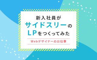
<figure class="photo-hover-style-1-1"><img src="画像.jpg" alt="新人まぽてぃがサイドスリーについて紹介" />
<figcaption>
<p class="title">新人からみたサイドスリー</p>
<a href="/blog/6681/"> </a> </figcaption>
</figure>
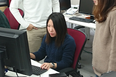
<figure class="photo-hover-style-1-2"><img src="画像.jpg" alt="サイドスリーの重要MTGトキックオフMTG" />
<figcaption>
<p class="title">キックオフMTG</p>
<p class="text">サイドスリーの重要MTGをちらりとご紹介</p>
<a href="/blog/6786/"> </a> </figcaption>
</figure>
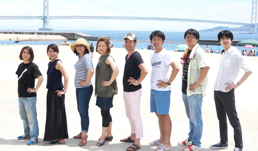
<figure class="photo-hover-style-1-3"><img src="画像.jpg" alt="楽しく仕事したい人募集中!採用情報はこちら" />
<figcaption>
<p class="title">採用情報</p>
<p class="text">楽しく仕事したい・のびのびと自分を成長させたい!などそんなサイドスリーメンバー募集中!採用情報はこちら</p>
<a href="/recruit/"> </a> </figcaption>
</figure>
</div>
CSS
.photo-hover-style-1 figure {
    position: relative;
    overflow: hidden;
    margin: 0;
    width: 100%;
    height: auto;
    background: #000000;
    text-align: center;
    cursor: pointer;
}
.photo-hover-style-1 figure + figure {
    margin-top: 15px;
}
.photo-hover-style-1 figcaption,
.photo-hover-style-1 figcaption a {
    position: absolute;
    top: 0;
    left: 0;
    width: 100%;
    height: 100%;
    z-index: 2;
    padding: 2em;
    color: #fff;
    text-transform: uppercase;
    backface-visibility: hidden;
    -webkit-backface-visibility: hidden;
    line-height: 1.4;
    margin-bottom: 15px;
    display: block;
}
.photo-hover-style-1 figcaption a {
    opacity: 0;
}
.photo-hover-style-1 .photo-hover-style-1-1 figcaption:after {
    position: absolute;
    top: 0;
    left: 0;
    width: 100%;
    height: 100%;
    border-top: 1px solid #fff;
    border-bottom: 1px solid #fff;
    content: '';
    opacity: 0;
    -webkit-transform: rotate3d(0, 0, 1, 45deg) scale3d(1, 0, 1);
    transform: rotate3d(0, 0, 1, 45deg) scale3d(1, 0, 1);
    -webkit-transform-origin: 50% 50%;
    transform-origin: 50% 50%;
    transition: opacity 0.35s, transform 0.35s;
}
.photo-hover-style-1 .photo-hover-style-1-1:hover figcaption:after {
    opacity: 1;
    -webkit-transform: rotate3d(0, 0, 1, 45deg) scale3d(1, 1, 1);
    transform: rotate3d(0, 0, 1, 45deg) scale3d(1, 1, 1);
}

.photo-hover-style-1 .photo-hover-style-1-1 img {
    height: auto;
    -webkit-transition: opacity 0.35s, -webkit-transform 0.35s;
    transition: opacity 0.35s, transform 0.35s;
    width: 100%;
}
.photo-hover-style-1 .photo-hover-style-1-1:hover img {
    opacity: 0.7;
    -webkit-transform: scale3d(1.05, 1.05, 1);
    transform: scale3d(1.05, 1.05, 1);
}
.photo-hover-style-1 .photo-hover-style-1-1 figcaption .title {
    -webkit-transition: -webkit-transform 0.35s;
    transition: transform 0.35s;
    font-size: 28px;
    font-weight: bold;
    text-shadow: 0px 2px 10px rgba(0, 0, 0, 1.00);
    opacity: 1;
    -webkit-transform: scale3d(1, 1, 1);
    transform: scale3d(1, 1, 1);
    padding: 0;
    text-transform: none;
    position: absolute;
    top: 0;
    bottom: 0;
    left: 0;
    right: 0;
    margin: auto;
    height: 50px;
}
.photo-hover-style-1 .photo-hover-style-1-1 figcaption .title,
.photo-hover-style-1 .photo-hover-style-1-2 figcaption .title,
.photo-hover-style-1 .photo-hover-style-1-3 figcaption .title {
    color: #fff;
}
.photo-hover-style-1 .photo-hover-style-1-2 {
    background: #B61C2C;
}
.photo-hover-style-1 .photo-hover-style-1-2 figcaption:before,
.photo-hover-style-1 .photo-hover-style-1-2 figcaption:after {
    position: absolute;
    top: 10px;
    right: 10px;
    bottom: 10px;
    left: 10px;
    content: '';
    opacity: 0;
    -webkit-transition: opacity 0.35s, -webkit-transform 0.35s;
    transition: opacity 0.35s, transform 0.35s;
}
.photo-hover-style-1 .photo-hover-style-1-2 figcaption:before {
    border-top: 1px solid #fff;
    border-bottom: 1px solid #fff;
    -webkit-transform: scale(0,1);
    transform: scale(0,1);
}
.photo-hover-style-1 .photo-hover-style-1-2 figcaption:after {
    border-right: 1px solid #fff;
    border-left: 1px solid #fff;
    -webkit-transform: scale(1,0);
    transform: scale(1,0);
}

.photo-hover-style-1 .photo-hover-style-1-2:hover figcaption:before,
.photo-hover-style-1 .photo-hover-style-1-2:hover figcaption:after {
    opacity: 1;
    -webkit-transform: scale(1);
    transform: scale(1);
}
.photo-hover-style-1 .photo-hover-style-1-2 figcaption .title {
    padding-top: 5%;
    -webkit-transition: -webkit-transform 0.35s;
    transition: transform 0.35s;
    -webkit-transform: translate3d(0,-20px,0);
    transform: translate3d(0,-20px,0);
    word-spacing: -0.15em;
    margin: 0;
    font-size: 28px;
    font-weight: 600;
}
.photo-hover-style-1 .photo-hover-style-1-2 .text {
    padding: 20px 2.5em;
    opacity: 0;
    -webkit-transition: opacity 0.35s, -webkit-transform 0.35s;
    transition: opacity 0.35s, transform 0.35s;
    -webkit-transform: translate3d(0,20px,0);
    transform: translate3d(0,20px,0);
}
.photo-hover-style-1 .photo-hover-style-1-2:hover .title {
    opacity: 1;
    -webkit-transform: translate3d(0,0,0);
    transform: translate3d(0,0,0);
}
.photo-hover-style-1 .photo-hover-style-1-2:hover .text {
    opacity: 1;
    -webkit-transform: translate3d(0,0,0);
    transform: translate3d(0,0,0);
}
.photo-hover-style-1 .photo-hover-style-1-2 img {
    opacity: 0.7;
    -webkit-transition: opacity 0.35s;
    transition: opacity 0.35s;
    position: relative;
    display: block;
    max-height: 100%;
    max-width: 100%;
}
.photo-hover-style-1 .photo-hover-style-1-2:hover img {
    opacity: 0.4;
}
.photo-hover-style-1 .photo-hover-style-1-3 {
    background: #B61C2C;
}
.photo-hover-style-1 .photo-hover-style-1-3 .title,
.photo-hover-style-1 .photo-hover-style-1-3 .text {
    position: absolute;
    bottom: 0px;
    left: 0;
    padding: 10px 30px;
    -webkit-transition: -webkit-transform 0.35s;
    transition: transform 0.35s;
    margin: 0;
}
.photo-hover-style-1 .photo-hover-style-1-3 .title {
    font-size: 28px;
    font-weight: 600;
}
.photo-hover-style-1 .photo-hover-style-1-3 .text {
    text-transform: none;
    font-size: 90%;
    opacity: 0;
    -webkit-transition: opacity 0.35s, -webkit-transform 0.35s;
    transition: opacity 0.35s, transform 0.35s;
    -webkit-transform: translate3d(0,50px,0);
    transform: translate3d(0,50px,0);
    line-height: 1.3;
    text-align: left;
    color: #fff;
}
.photo-hover-style-1 .photo-hover-style-1-3 img {
    -webkit-backface-visibility: hidden;
    backface-visibility: hidden;
    -webkit-transition: -webkit-transform 0.35s;
    transition: transform 0.35s;
    position: relative;
    display: block;
    max-height: 100%;
    max-width: 100%;
    opacity: 0.8;
}
.photo-hover-style-1 .photo-hover-style-1-3:hover img {
    -webkit-transform: translate3d(0,-60px,0);
    transform: translate3d(0,-60px,0);
}
.photo-hover-style-1 .photo-hover-style-1-3:hover .title {
    -webkit-transform: translate3d(0,-80px,0);
    transform: translate3d(0,-80px,0);
}
.photo-hover-style-1 .photo-hover-style-1-3:hover .text {
    opacity: 1;
    -webkit-transform: translate3d(0,0,0);
    transform: translate3d(0,0,0);
}

@media (max-width:767px) {
    .photo-hover-style-1 .photo-hover-style-1-1 figcaption .title,
    .photo-hover-style-1 .photo-hover-style-1-2 figcaption .title,
    .photo-hover-style-1 .photo-hover-style-1-3 figcaption .title {
        font-size: 18px;
    }
    .photo-hover-style-1 .photo-hover-style-1-2 figcaption .text,
    .photo-hover-style-1 .photo-hover-style-1-3 figcaption .text {
        font-size: 13px;
    }
    .photo-hover-style-1 .photo-hover-style-1-2 figcaption .text {
        padding-top: 0;
    }
}
ぜひぜひ使ってみてください~!